Overview
This was a project for a User Experience Design course run by General Assembly, February - April, 2021.
The goal of the project was to design a solution to help new Toastmasters develop evaluation skills.
Background
“We all need people who will give us feedback. That’s how we improve.”
— Bill Gates
Whether it’s delivered constructively or not, we give and receive feedback in all areas of life. It’s in the work performance review , the comments section of the blog we write or that conversation we all dread when the school report isn’t up to scratch. And yet despite its ubiquity, it remains a relatively overlooked and under-supported skill.
In this project, I was particularly interested in helping those new to the skill of evaluation in the world of Toastmasters, the non-profit educational organisation originally set up to help people to learn to “talk by talking” and which now teaches public speaking and leadership skills through a network of clubs in more than 16, 200 clubs in 145 countries.
As a former member of a Toastmasters club in Shanghai I understood the pains of giving evaluations, and wanted to better understand the challenges that new members face when they step up and take on the role of individual evaluator. More specifically, I wanted to explore what new members find exactly hard about delivering 2-3 minutes of oral feedback on a 5-7 minute speech of another member.
Equally importantly, I wanted to design practical solutions to address those particular pain points. New members may be unable or too fearful to stand up and take on the role. Or, they may come from an under-resourced Toastmaster club that is unable to provide the support or proper feedback that new members need to get better at providing constructive feedback.
The Design Process
Understanding the problem
The next step was to learn more about the challenges for individual evaluators.
TASK ANALYSIS
First, I did a task analysis to identify the stages of an individual evaluation. This would help me to know what to cover in upcoming user interviews.
Task: Give an Individual Evaluation
1.Sign up to be an individual evaluator of another toastmaster’s speech 2.Receive and review the speech objectives 3.Contact speaker to confirm speech objectives and any other personal goals for the speech 4.Prepare for note-taking 5.Watch 5-7 minute speech 6.Prepare individual evaluation 7.Deliver 2-3 minute individual evaluation 8.Give written feedback to speaker 9.Receive feedback on evaluation
USER INTERVIEWS
Next, I conducted 7 user interviews to uncover any pain points users experienced at any stage of the evaluation process.
User characteristics:
— all members of the same Toastmasters club, Shanghai 5C+ Toastmasters International
— mixed levels of experience as an individual evaluator, from as little as just a few months to 3 years +
— 2 English-speaking background, 5 non-English-speaking background
Interviews were conducted virtually over Zoom with the help of transcription software, Otter.ia for later reference and analysis.
The purpose of the user interviews was to find answers to two basic questions: 1.What do users find hard about giving feedback? 2. How have learners learnt how to give feedback?
To help both interviewer and user, I created a user interview discussion guide that set out:
1. the context of the interview for the user
2. the purpose of the interview
3. specific questions to elicit user personal details
4. open questions to uncover any pain points and how the user learnt to give feedback:
i. Can you walk me through your last individual evaluation? How did you feel?
ii.Can you walk me through how you learnt to give individual evaluations?
AFFINITY MAPPING
After the user interviews, I conducted affinity mapping to systematically gather insights. This process synthesised the major pain points identified and grouped them under common themes from the perspective of individual evaluators rather than just a bunch of data points.
Here is the affinity mapping process:
For easier reading, here is the larger version of the affinity map. Note that the user’s point of view is expressed with ‘I’ statements.
INSIGHTS
Distilled, the 3 key insights were as follows:
The whole process is too complicated
Feedback needs to be immediate
The process shouldn’t be dragged out
PERSONA
PROBLEM STATEMENT
New Toastmaster members like David need to find a simpler and more time-efficient way to practice evaluation and receive feedback.
HYPOTHESIS
We believe that a simpler and more time-efficient way to practice evaluation and receive feedback will lead to positive attitudinal change and skill gains. We know this to be true when we see an increase in the confidence of Toastmasters like David, evidence of more regular practice and feedback, and ultimately better evaluation skills.
HOW MIGHT WE
In the interests of considering as many solutions as possible and without ruling out any too soon or too hastely, the next step was to identify the biggest pain point in terms of a ‘how might we’ statement:
How might we simplify the evaluation process for new, aspiring but time-poor toastmaster members like David?
SOLUTION SKETCHING


FEATURE PRIORITISATION
I prioritised features that would have a high impact upon David, as well as the effort and expense required to design and make them.
The first feature was a progress bar. This would give David clear idea of where he was in the session.
Another was a timer feature. This would provide clear idea of how far through a particular stage David had gone. It also provided something familiar to the timer cards used in toastmaster meetings.
Video conferencing is another high impact feature. Video would provide David with access to immediate feedback on his evaluation. It would be delivered orally and in real time by a more experienced toastmaster, mirroring what is done in a real toastmasters meeting but at a time and location that suits each person.
The diary feature is a simple feature that David could use immediately following an evaluation session to reflect on what he’d do differently next time given the feedback on his most immediate evaluation.
CUSTOMER JOURNEY
At this stage of the design process, I’d like to envision David’s journey through his first session of a 30-day evaluation challenge.
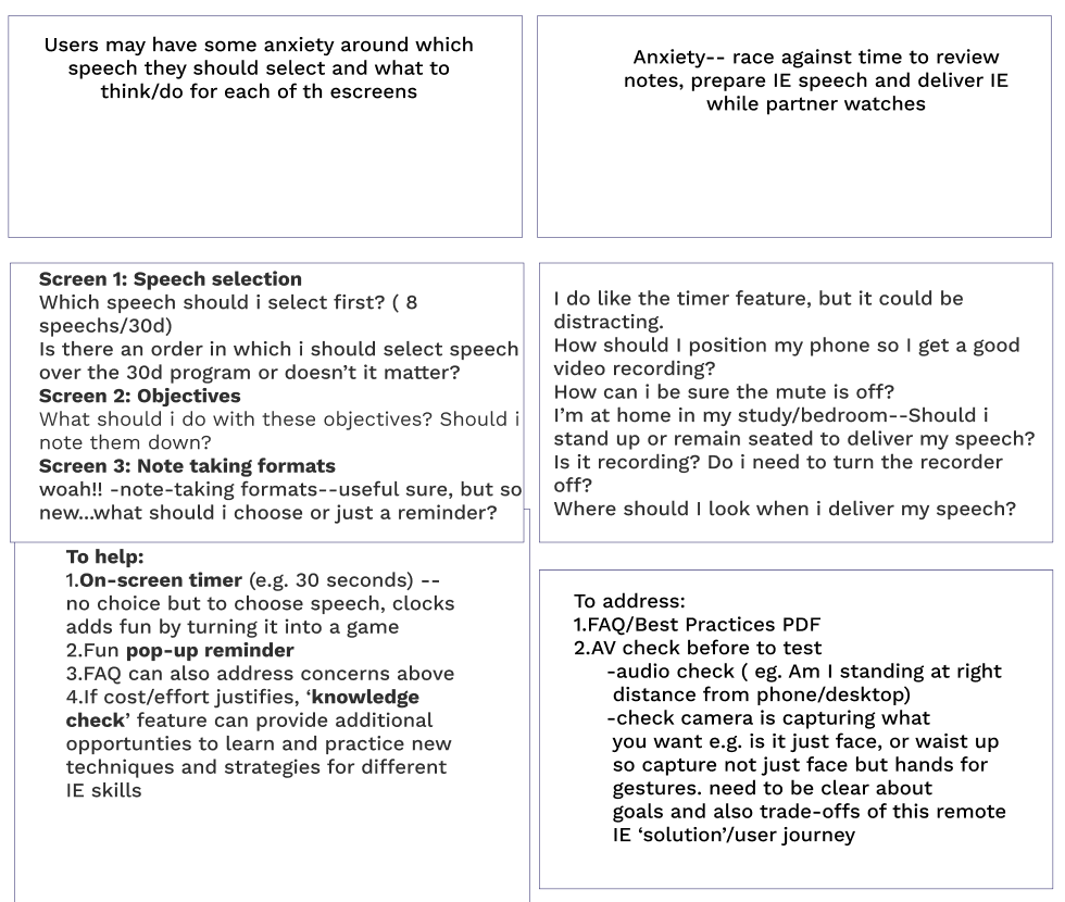
To help with this process, I have constructed a user journey map for David to provide an initial, high level visualisation of what those session stages may be and the sequence in which they may occur.
Second — and based upon what we know about David — it imagines the likely highs and lows he’ll experience in terms of what he’ll be feeling and thinking at each of the stages.
From the issues, questions and concerns raised, this will make it easier to think of opportunities that the eventual solution will aim to address.
The most anxious stage of the first session also happens to be the busiest stage of the session for David. This is when he is handling multiple tasks at the same time in which he is watching the speech, taking notes, and also reviewing notes in preparing for the evaluation itself.
INFORMATION ARCHITECTURE
David’s aims are straightforward: more regular evaluation practice and feedback delivered in an accessible and time-efficient way. To make this happen, very flat, with easily discoverable content.
USABILITY TEST #1
TASK #1: PROOF OF CONCEPT
It was important to get feedback on what toastmasters thought of the concept of 30-day evaluation practice app, and the ideas I had for the basic and pro versions of the app.
The task
To do this, I provided a quick walkthrough of the basic and pro versions of the evaluation challenge and then asked users what they though of each concept and which version, if any, appealed to them the most and why.
CONCEPT FEEDBACK
TASK #2: PROOF OF PROTOTYPE
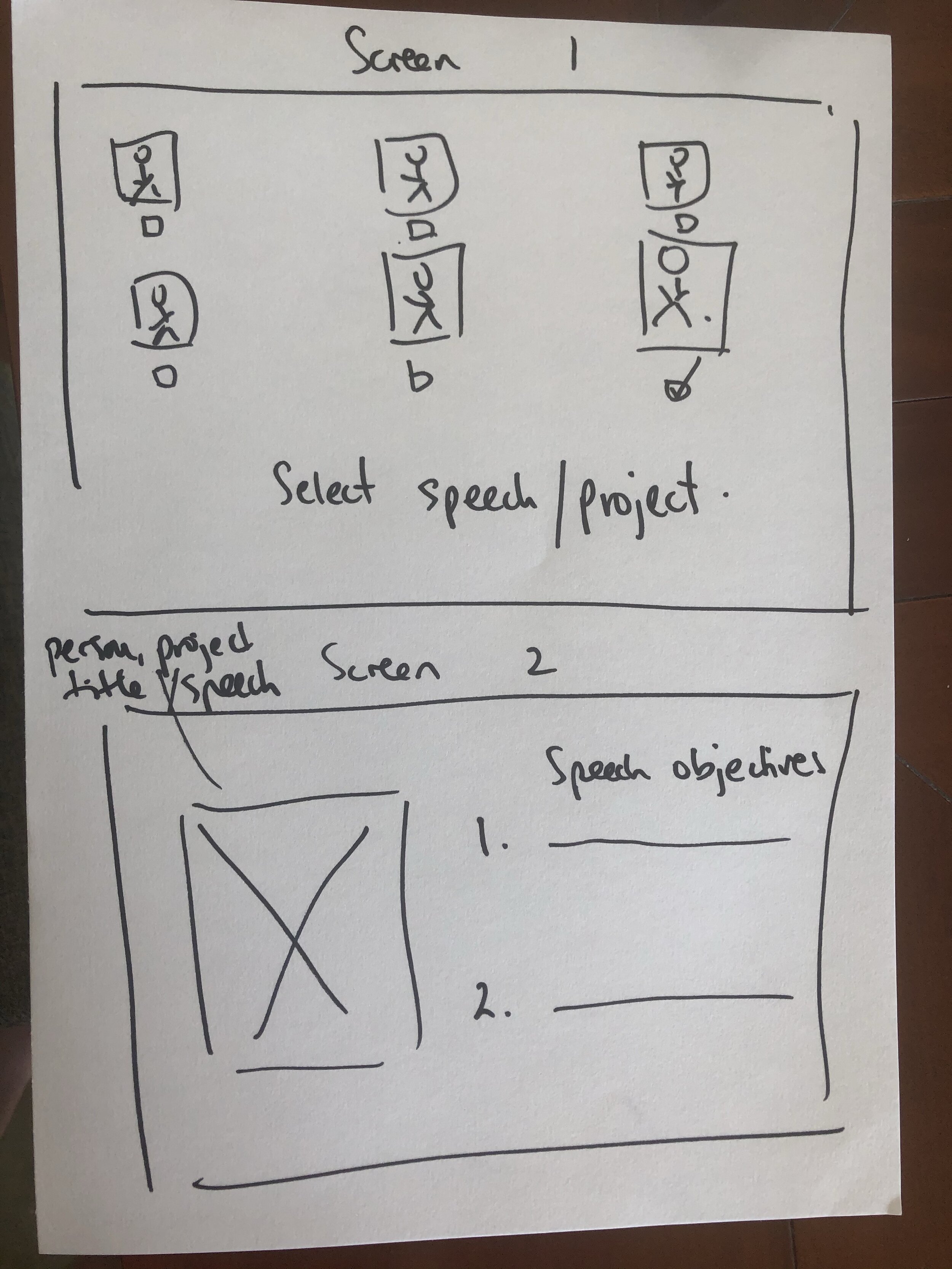
It was also important to get user’s feedback on early stage wireframes
The task
I got users to think out aloud as they walked their way through some low-fi wireframes, with the following guidance provided:
You have decided to do the ‘Let’s evaluate’ 30 day challenge. You have installed the app and selected dates and times that work for you. Now it’s time to do your first ‘Let’s evaluate’ session. Here’s the homescreen. Tell me what you see and what you would do and why. I may stop you and ask you questions. Also, please let me know if you find anything confusing.
PROTOTYPE FEEDBACK
DESIGN SYSTEM
To keep things as simple and consistent as possible, I created:
a type scale using 2 typefaces
a color scheme
fixed 5-column grid layout with 20px margins, and 20px gutters to give us a nice, even look and feel
card templates
Typescale
I chose Roboto Slab and SF Pro Display because :
both work well on small screen and larger screens — Roboto Slab for titles and button text, and SF Pro Display for body text and the smaller text found in progress bars and navigation panel.
both have multiple weights and styes to choose from
the clean, plain and simple design distracts less, keeping users like David more on-task
reduces time needed for users to adjust to fonts since both are already familiar and widely-used fonts of Android and iOS operating systems. This speaks to Jacob’s Law that states that users prefer to work on sites that work in the same way as other sites.
Colour Scheme
I chose the colour palette of blue, black and white because:
it distracts less, keeping users on task and moving forward and through the session of time-boxed tasks
this monochromatic mix of colours is an uncontroversial choice and likely to be familiar to users of learning apps such Khan Academy or Udemy
USABILITY TEST # 2
Takeaway #1 : Stop the feature creep
During this second round of testing, the feedback I got was that while note-taking support was useful, it was not a core need for users like David. By iteration #3, note-taking support had been removed.
Takeaway # 2: Make it more conversational
The other feedback i received was that the copy was too impersonal and dry, and so by the second and particularly the third iteration, the copy was a lot more conversational, delighting and encouraging the user through all stages of the practice session
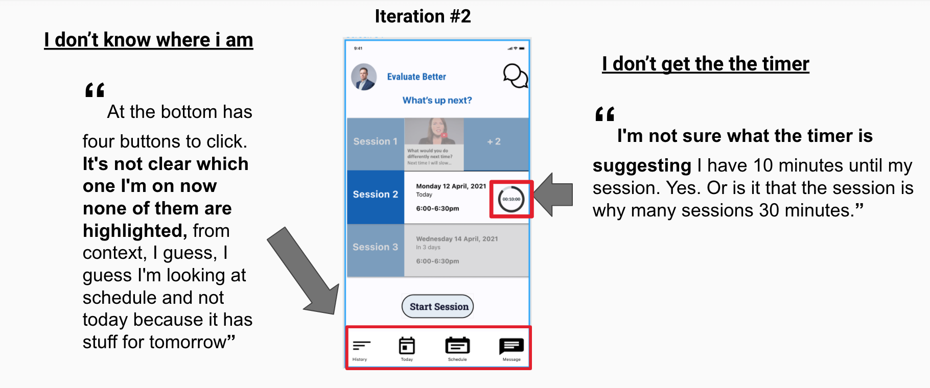
Takeaway # 3: Make it more intuitive
In earlier stage work, the home screen was confusing to users. They were confused about the role of the timer, and some of the buttons in the navigation panel. Over the course of successive iterations, the home screen was made to be more intuitive to the user and just more usable.


